[This is a minimal post due to very limited time.]
We need to check the assumptions of our linear model (e.g. regression, ANOVA, ANCOVA) are not too badly violated. We often use four diagnostic graphs to do so. One of these shows standardised residuals plotted against leverage (each observation has a value).
The take home message of this post is if your model contains at least one continuous explanatory variable, use the base R methods for making your diagnostic plots:
par(mfrow = c(2,2))
plot(my_model)
Here is an example that looks at relationship between earthworm mass (response variable) and two explanatory variables (species ID of the earthworm, and stomach circumference of the earthworm).
Prepare R:
library(tidyverse)
library(ggfortify)
Read the data and make English variable names:
worms <- read_csv("https://raw.githubusercontent.com/opetchey/BIO144/master/3_datasets/earthworm.csv") %>%
  rename(Mass = Gewicht,
         Species = Gattung,
         Stomach_circum = Magenumf)
## Parsed with column specification:
## cols(
##   Gattung = col_character(),
##   Nummer = col_double(),
##   Gewicht = col_double(),
##   Fangdatum = col_character(),
##   Magenumf = col_double()
## )
Plot and inspect the data:
worms %>%
  ggplot() +
  geom_point(mapping = aes(x = Stomach_circum, y = Mass, col = Species))
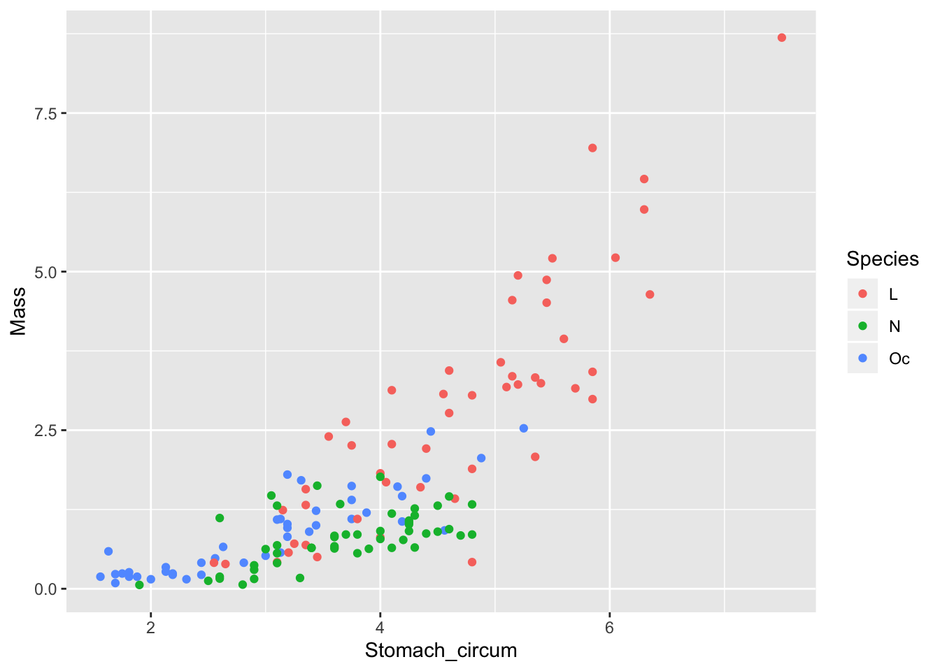
From this, we expect to see evidence of non-linearity in the diagnostic plot of residuals against fitted values (but this does not concern the issue addressed in this post).
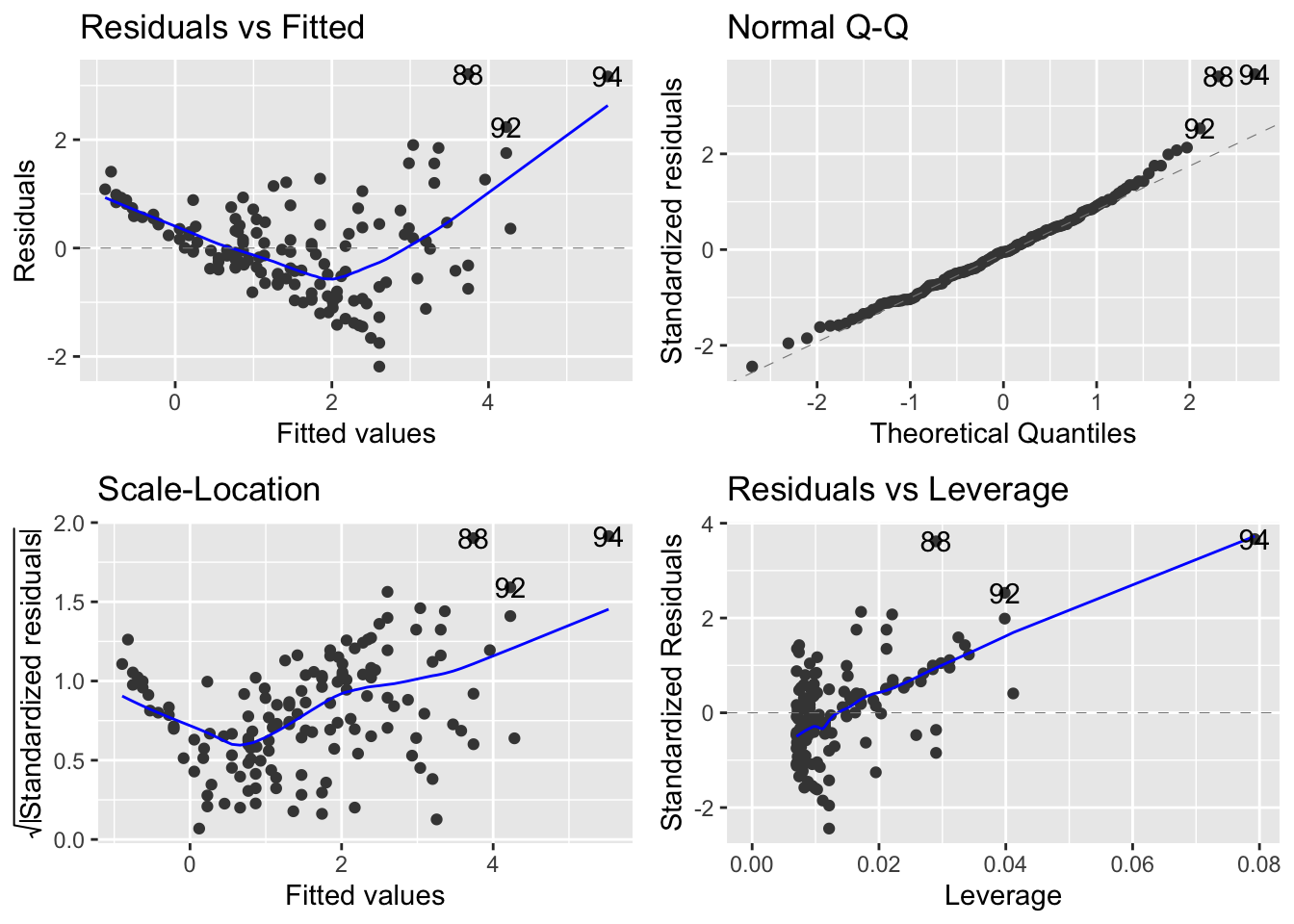
Now make the model including both explanatory variables and no interaction between them:
mod_sp_circ_noint <- lm(Mass ~ Stomach_circum + Species, data = worms)
Here is the base R method for making the four model diagnostic plots:
par(mfrow=c(2,2))
plot(mod_sp_circ_noint)
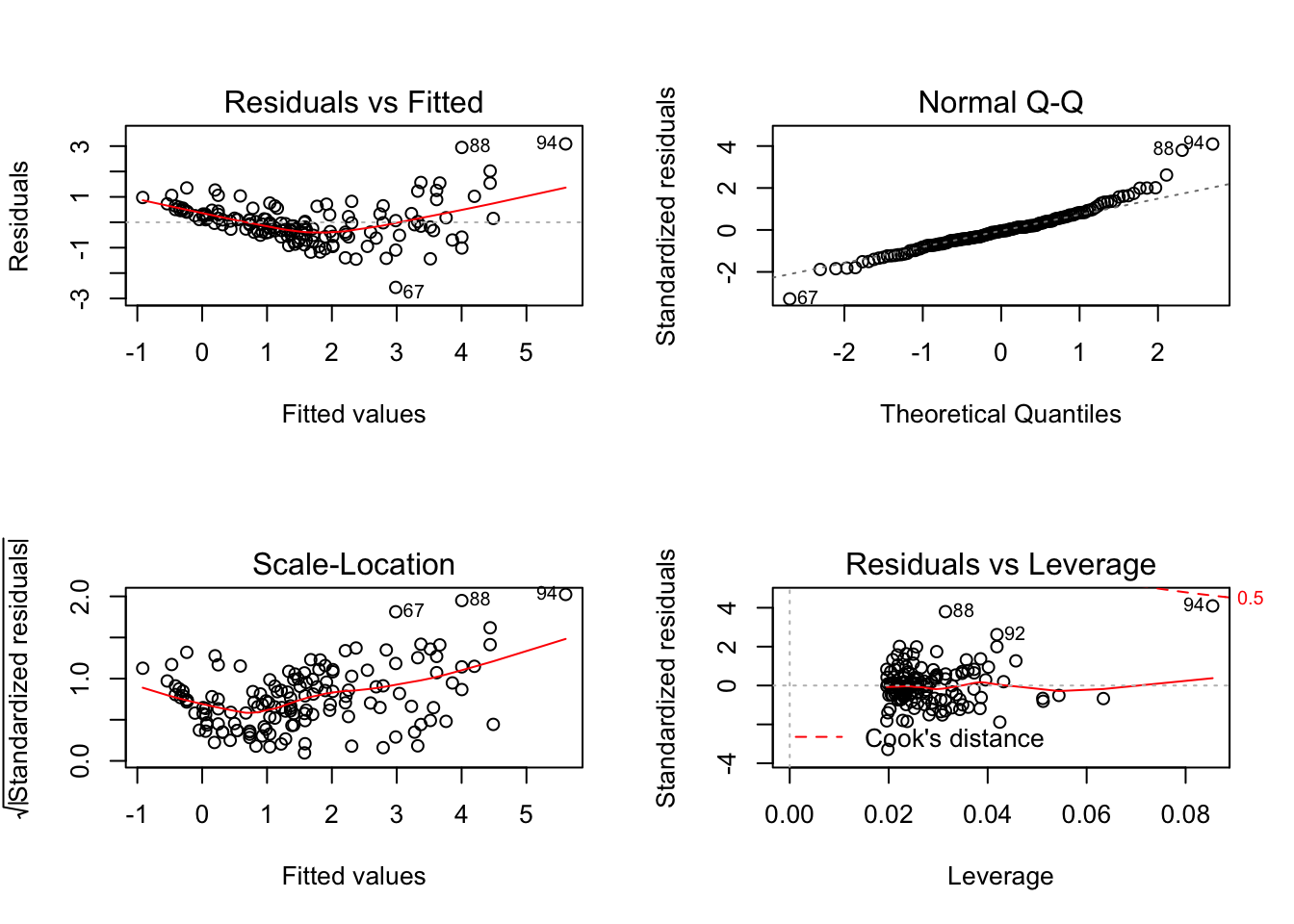
Take note of the plot of standardised residuals versus leverage.
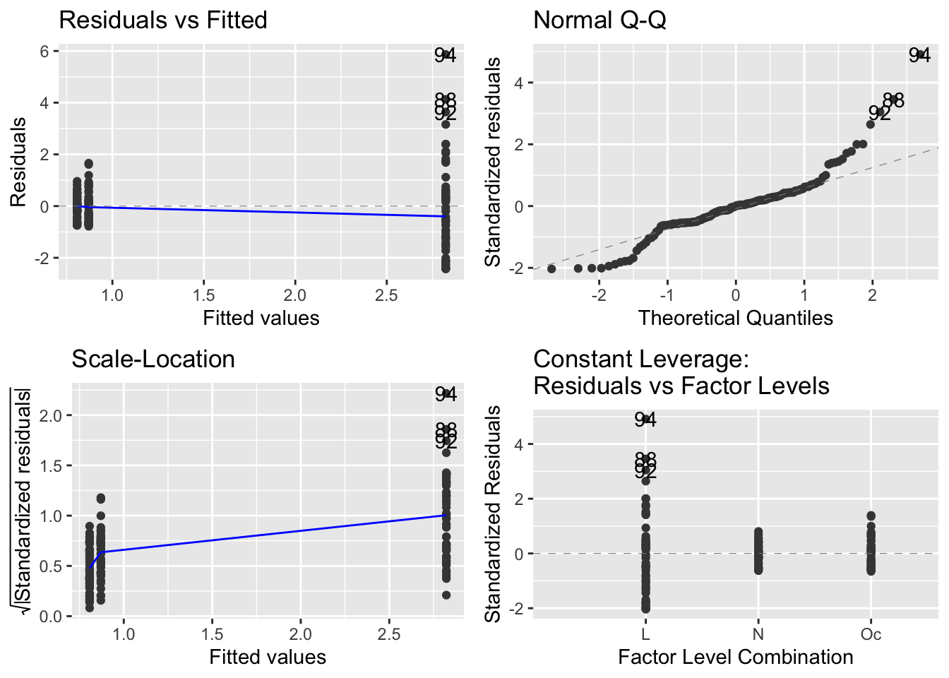
Now compare to the same produced by the autoplot function of the ggfortify package:
autoplot(mod_sp_circ_noint)
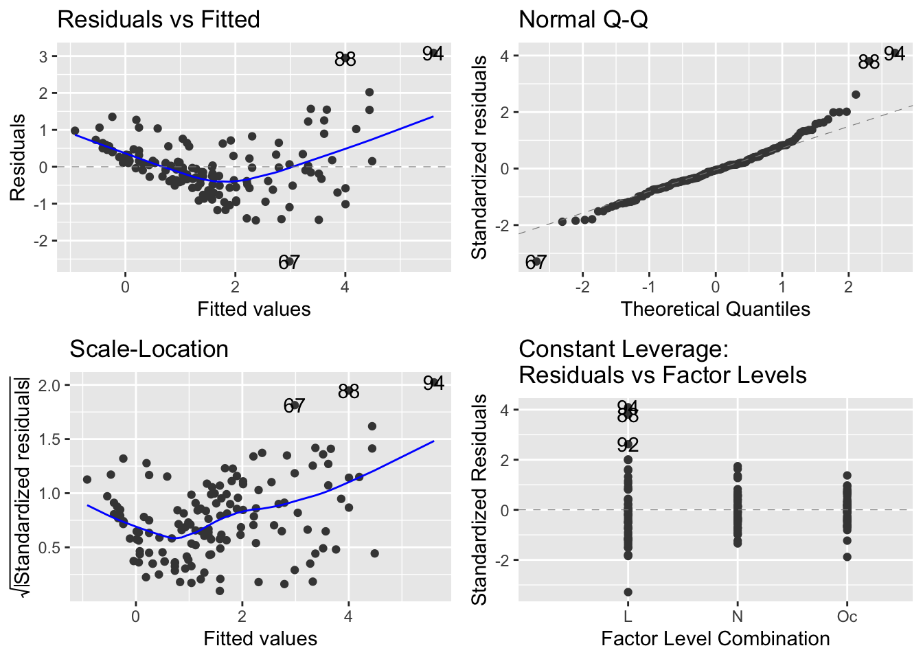
It seems that the autoplot function in the ggfortify package is not doing what we would like and expect… there is a continuous explanatory variable, so leverage is not constant, and it should make a graph with leverage on the x-axis.
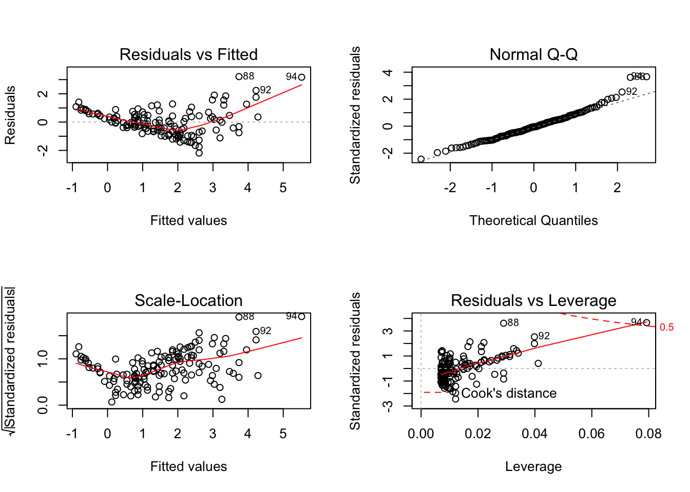
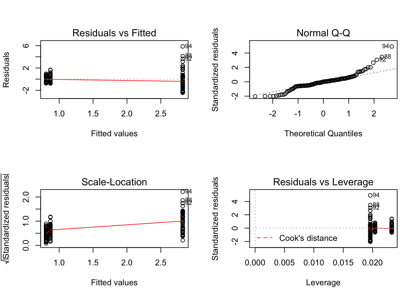
Compare this difference in behaviour between base R and ggfortify::autoplot when there is only a continuous explanatory variable in the model:
mod_circ <- lm(Mass ~ Stomach_circum, data = worms)
par(mfrow=c(2,2))
plot(mod_circ)
autoplot(mod_circ)
And when there is only a factor variable:
mod_spp <- lm(Mass ~ Species, data = worms)
par(mfrow=c(2,2))
plot(mod_spp)
autoplot(mod_spp)
I believe it is useful to have the residuals versus leverage plot if there is continuous explanatory variable, so would then use the base R method to make the diagnostic plots.